Is that a weird question: what does your exhibit remind visitors of?
But think about it. We all have triggers. There are things that we see in the present that reminds us of the past. Maybe it’s a song that takes you back to your childhood. Maybe it’s a smell that reminds of your first love. Could be anything.
Images, colors, stories: they all are shorthand and they can remind us of something. Things that make us happy, sad, safe, tense.
Back to your company’s tradeshow exhibit: what does it remind visitors of?
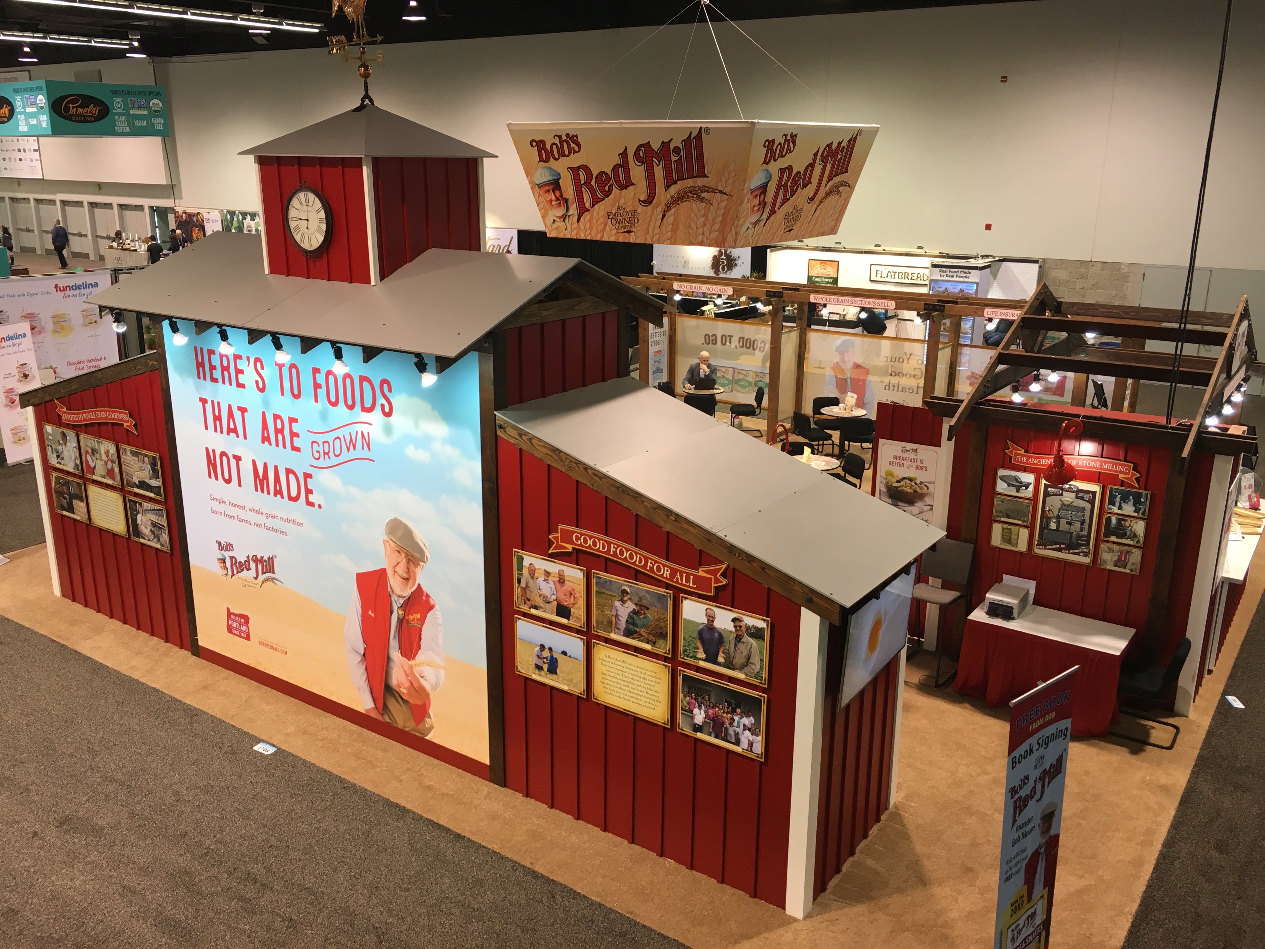
One good example comes from a client of ours, Bob’s Red Mill. Its iconic red mill structure is a stylized representation of what a lot of people see as harkening back to a different era. Mills represent the hand-crafted way of milling grains – the loving labor that goes into producing a high-quality product. We don’t actually see the millstone or how the grains are ground under the weight of the stone, but the mill reminds us of that.
On the tradeshow floor, stories are told in shorthand by using various materials, colors, shapes, fonts and more.
Green tells you: earth-friendly, plant-based, life, renewal, energy, harmony with nature.
Red is the color of fire, blood, energy, way, strength, power, passion, determination.
Orange combines the energy of red and yellow and communicates energy and happiness, enthusiasm, fascination, creativity, determination.
When it comes to shapes, meaning can be communicated in a lot of ways. Geometric shapes such as squares, rectangles, triangles, crosses.
Organic shapes are more free-flowing: circles, leaves, rocks, clouds, ink blots.
Fonts tell a story, probably one of the most important. Every font has a unique personality and purpose. Bold block fonts tell one story, while flowing script fonts tell another. Thin fonts tell a story that’s different than fat ones. There’s a psychology behind using various fonts that are more than I want to delve into here, but the topic is worth taking a deeper look.
Some brands have clearly designated, iconic images (the red mill of Bob’s, the iconic “T” of Tesla, the siren of Starbucks, the apple of both Apple Computers and Apple Records to name a few). These can easily be put on a tradeshow exhibit design.
Other brands are less-known or not as well-defined, and in those cases it often means working with a 3D exhibit designer with the skill to use the shapes, colors and fonts needed to clearly communicate the brand’s story in a glance with an exhibit.
If you don’t have an iconic, easily recognizable brand (yet), we go back to the question: what does your tradeshow exhibit remind visitors of?
Do the colors evoke good memories and associations? Do the shapes clearly communicate a message that brings up a positive connection?
It’s all worth considering as you market your business by using tradeshows. After all, a tradeshow is the perfect place to present a clearly-defined image to your visitors.