
A year ago at Expo West I scanned about 20 QR Codes to see how they worked and to see how companies were using the technology.
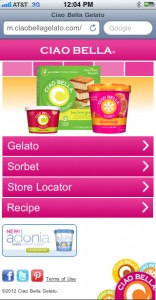
Ciao Bella's smartphone-optimized WR Code landing page
The results were disappointing. Not a single QR Code hit on all aspects of user-friendly usability. They fell into one of the follow categories: didn’t work at all (1); didn’t scan at all because they were too small, too far away (too high) or looked weird because they were on an uneven surface (temporary tattoos) (about 15 of them); or the URL landing page wasn’t optimized for a smart phone (the remainder).
This year at Expo West I wasn’t as scan-happy, but I did find that many more QR Codes did work, and did exactly what they intended. Not all, but many. Out of about a dozen
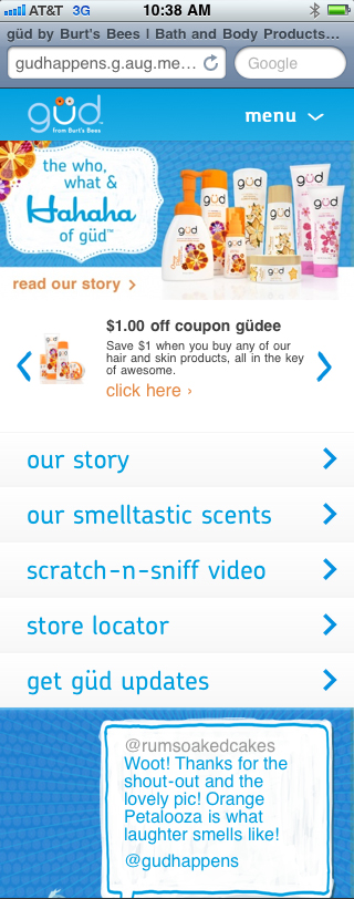
Burt's Bee's 'Gud' smartphone-optimized WR Code landing page
codes I scanned, all of them worked (they took me to a landing page), and about half of the landing pages were optimized for viewing in a smart phone.
Some notable examples: Gud, from Burt’s Bees and Ciao Bello (see screen shots). Both had nice looking landing pages, which were easy to navigate, and very inviting. Both accomplished their purposes of providing a good answer to the question: why should I scan this QR Code.
Check out the Kindle version of my QR Code Tradeshow Marketing Guide here (cheap!) if you want to know how to make these puppies work right.
 Tim Patterson has been helping companies navigate the trade show world since 2002. He owns TradeshowGuy Exhibits and writes here about exhibit design, marketing, industry trends, and lessons learned from more than two decades on the show floor.